1. Once the app is opened, faculty can tap the analytics icon on the footer to access Analytics.
Note: Analytics feature is only available on Mobile Applications as of now.
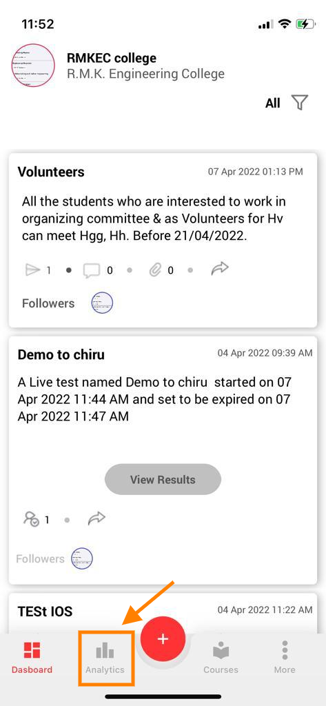
2. When the Analytics icon is selected, the faculty will be able to see their assessment cards and the details.
- We have a feature to show Assessments activity according to the filters applied. You’ll learn more about the filters below.
3. With the graphs, we can see the no. of Assessments conducted vs the time or dates selected. The filter selected will also apply to the graphs.
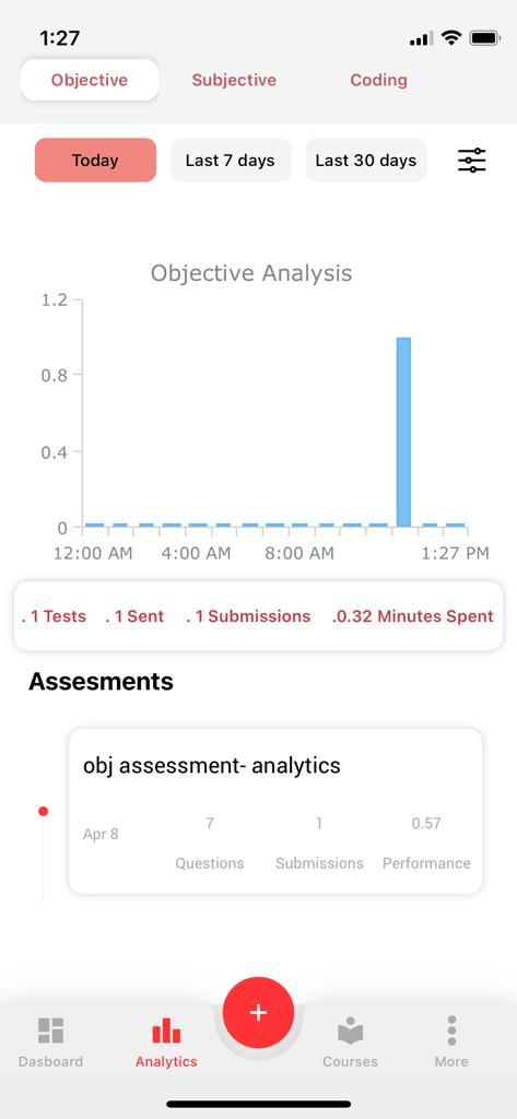
4. The assessment cards display
- No. of questions present in that assessment.
- No. of submissions done for that assessment.
- The average performance of students for that assessment.
Apply Filters :
Applying ‘Today’ Filter :
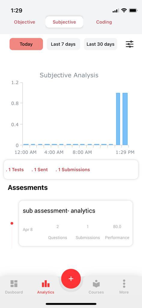
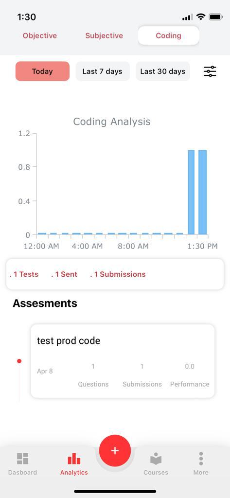
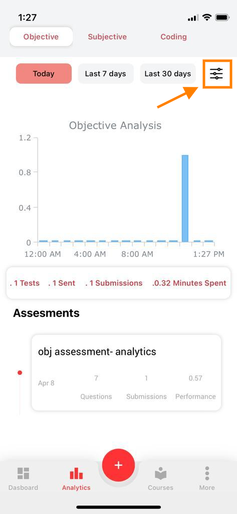
5. When the faculty taps on the ‘Today‘ filter, analytics will display only the assessment cards which were created on that particular day (i.e Today), for the selected assessment module (i.e objective or subjective or coding).
NOTE : Any filter that is applied in a specific Assessment module will be RESET once we move to Analytics of another Assessment module.
Applying ‘Last 7 Days’ Filter :
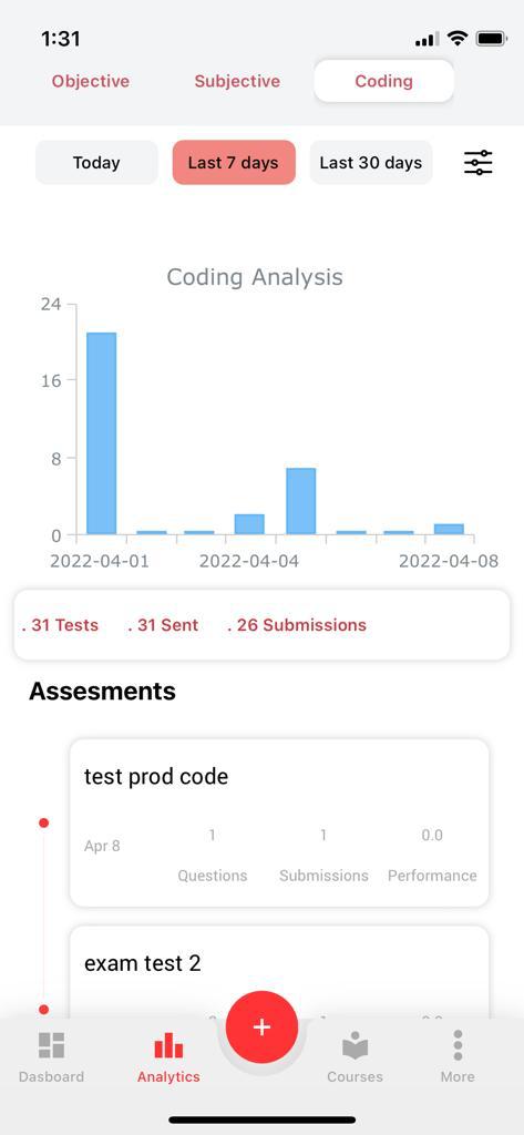
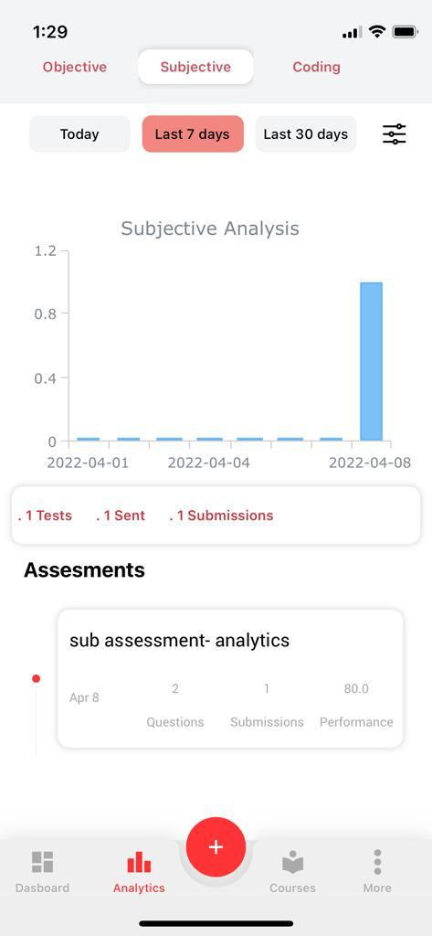
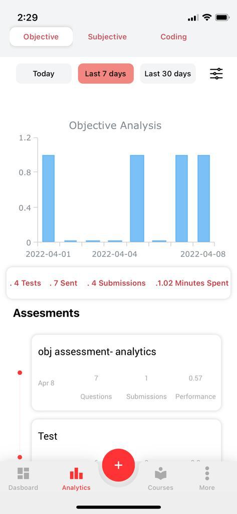
6. When the ‘Last 7 days‘ filter is applied, analytics will display only the assessment cards which were created in the last 7 days, for the selected assessment module (i.e objective or subjective or coding).
Applying ‘Last 30 Days’ Filter :
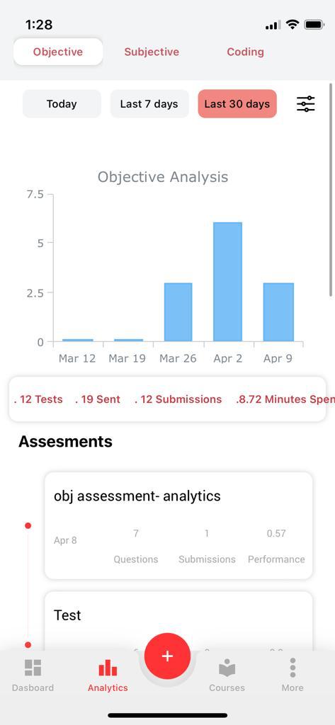
7. When the ‘Last 30 days‘ filter is applied, analytics will display only the assessment cards which were created in the last 30 days, for the selected assessment module (i.e objective or subjective or coding).
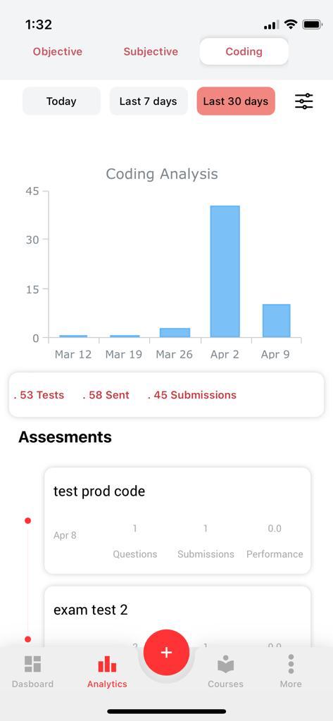
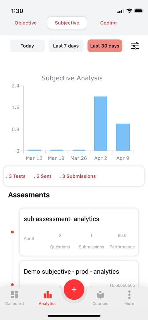
8. Faculty has a custom filter feature which can be accessed by selecting the filter icon on the top right.
With this feature, faculty can filter the analytics by
- Custom dates
- Department(s)
- Subject(s)
- Class/Section(s)
Note: This custom filter will filter both the assessment cards being shown and the graph data.
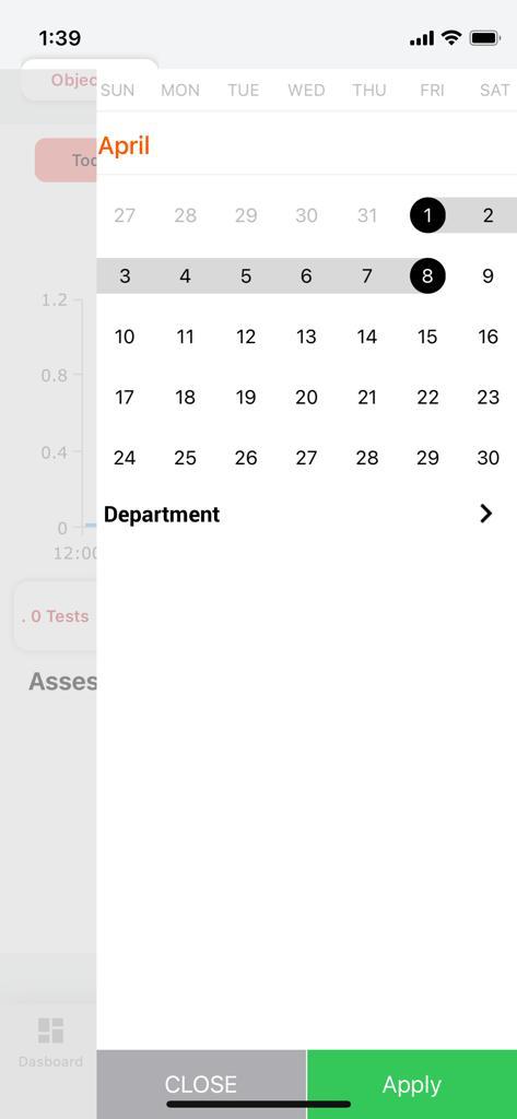
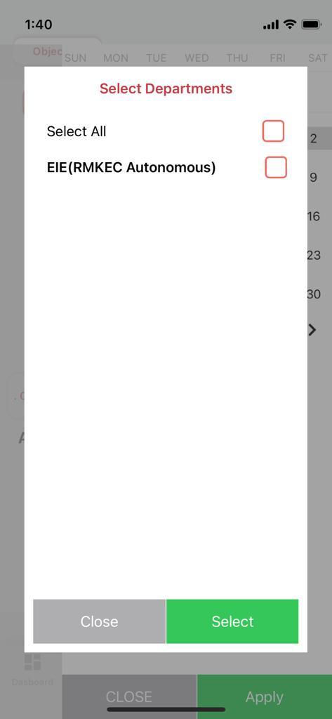
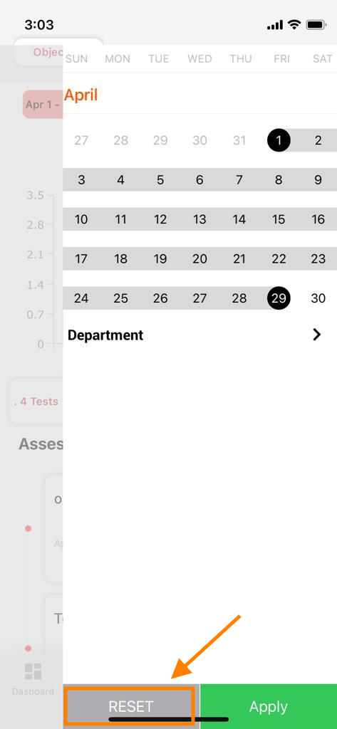
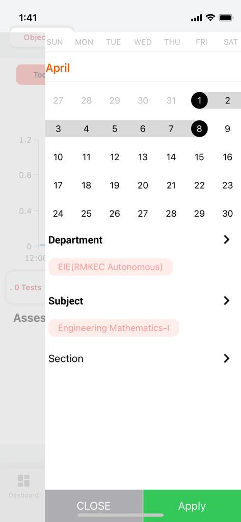
9. To remove the custom filters the user can tap on the Reset button beside the Apply button in the dates filter.

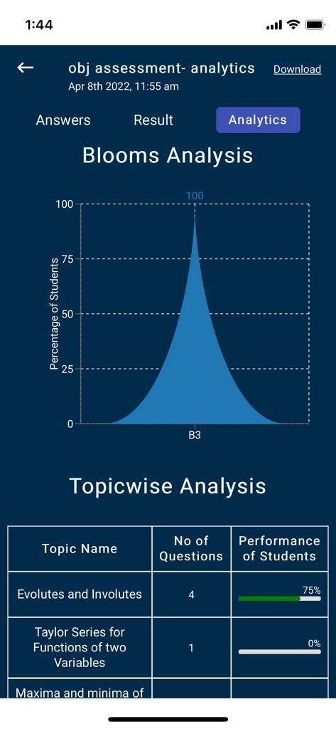
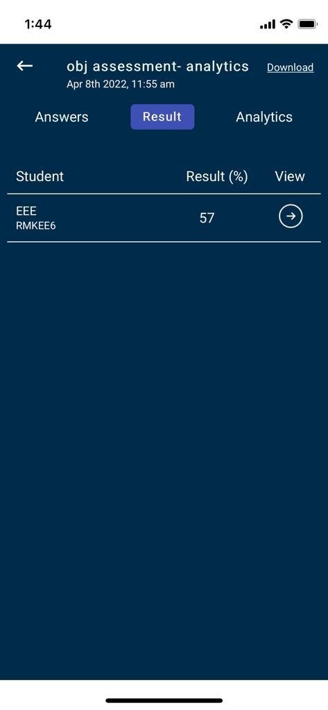
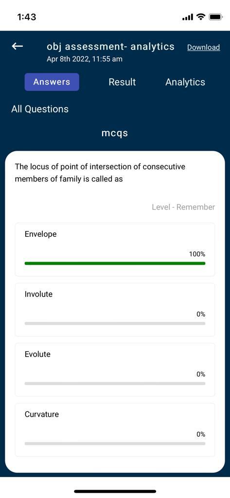
10. The faculty can select the assessment cards to get a detailed analysis of each and every question present in the selected assessment.
Summary :
A dashboard of yours, viewing participation metrics, leaderboard, detailed subject analysis which includes unit-level analysis, topic analysis, and overall performance statistics.
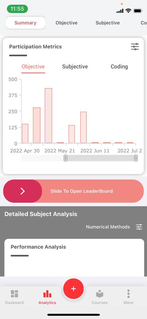
a. Participation Metrics:-
It gives an overview of all the assessment performances (Objective, Subjective, Coding) attempted by the students.
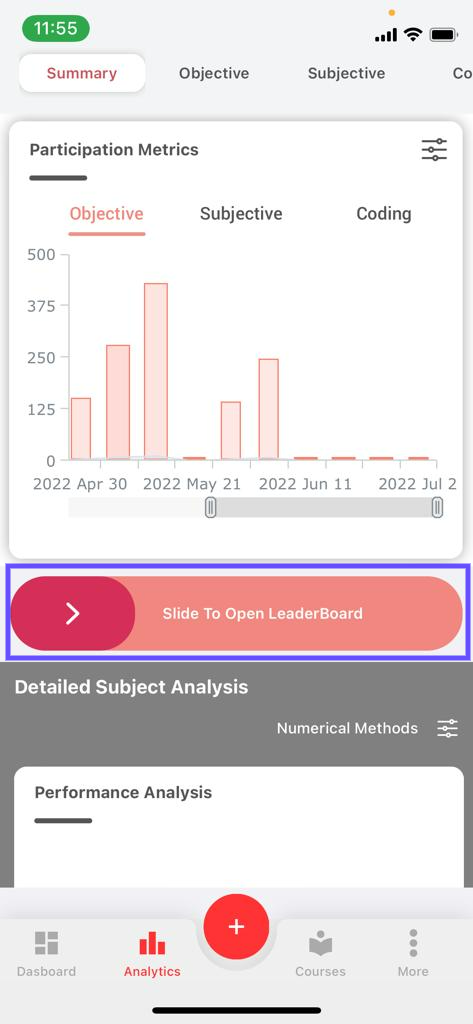
11. Select either Objective or Subjective or Coding (By default Objective is selected).

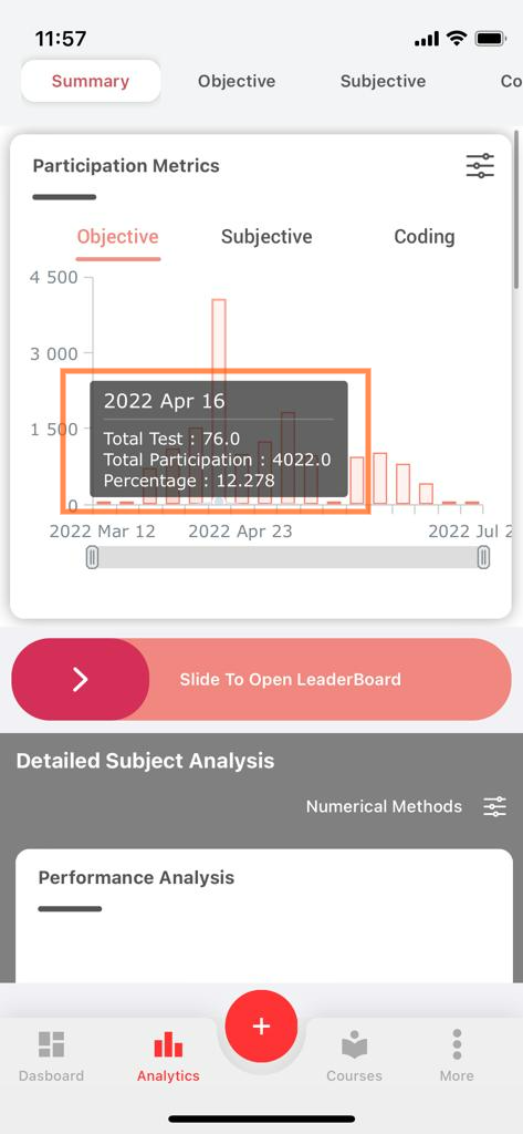
12. The participation metrics are shown for all the subjects in the current academic semester.
13. The bar in the graph depicts the total number of tests assigned by you, the total participation of the students, and the percentage obtained by the students in those tests by tapping on it.
14. In order to view the graph closely, you can pinch-zoom the graph or compress and expand using the scale given below the graph.
15. To get the subjective and coding analytics, select the subjective or coding filter option present above the graph.
b. Leaderboard:-
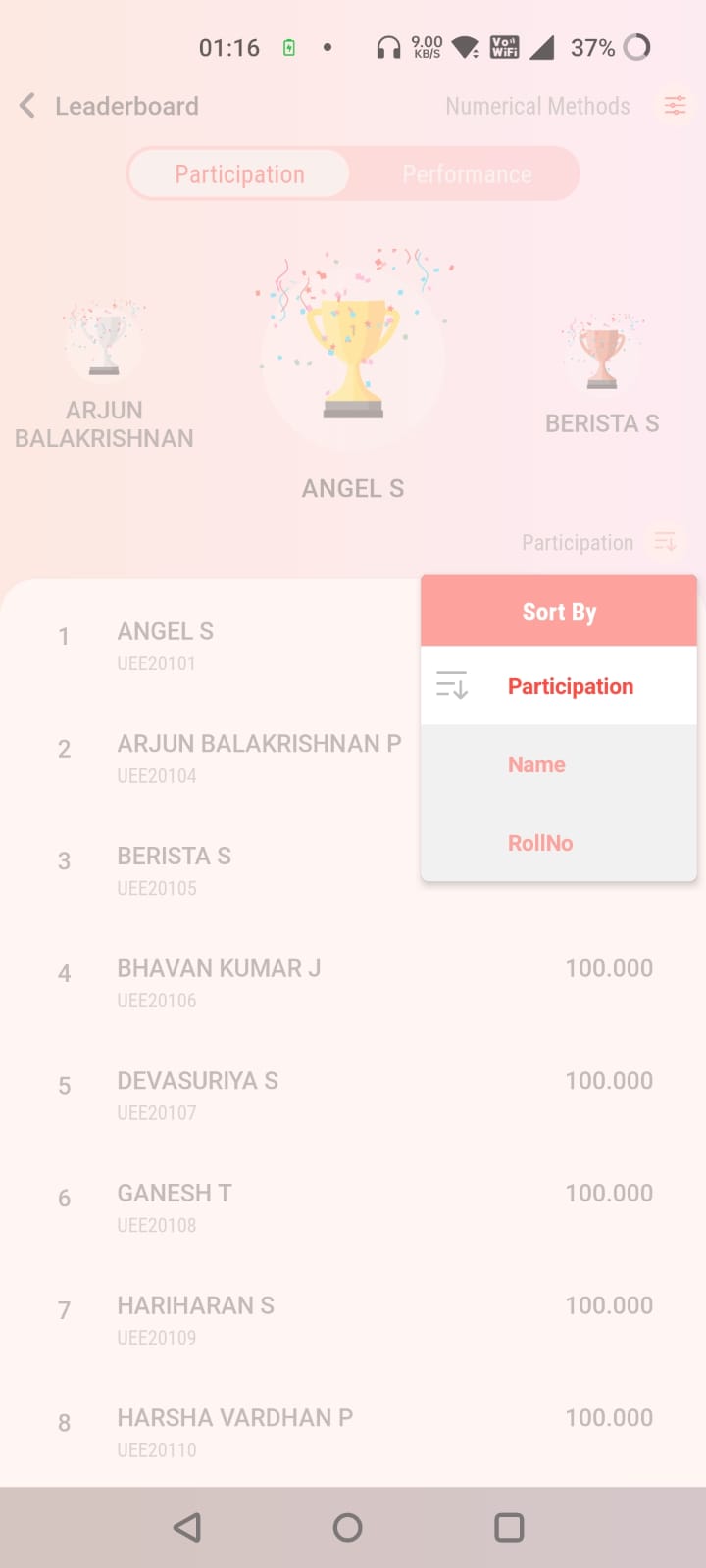
Each student’s performance and participation can be viewed on the leaderboard in a detailed way for all the assessments assigned by you across all the semesters and sections.
16. On swiping the leaderboard toggle, you will be navigated to the leaderboard page wherein it shows:
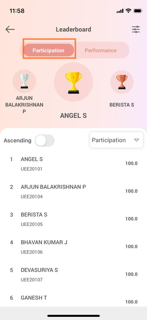
- The top three performers are displayed on the top. To toggle between the participation and performance metrics you can use the participation/performance tabs given on the top.
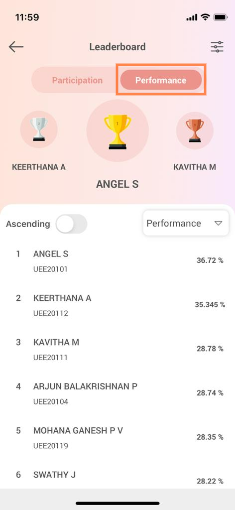
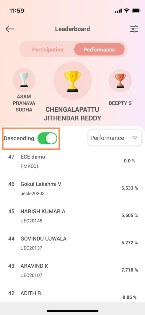
- List of students present in that particular section: The list can be sorted using the filters present (Participation, Name, Roll No.) in ascending or descending order as per your preference.
c. Detailed Subject Analysis:-
This gives you insights into the performance of the students through performance analysis(considering each unit in a subject) and topic analysis(considering each topic in a unit).
- Performance analysis:-
A bar chart that gives you a detailed analysis of the student performances for each unit in the selected subject.
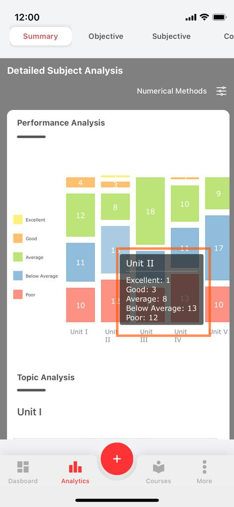
17. You can get the performance status of the students (excellent, good, average, below average, poor) for each subject by tapping on the individual bar based on the applied filters.
- Topic analysis:-
A tree map that gives you insights on the number of right answers and percentage scored by the students in each topic by tapping on the required topic.
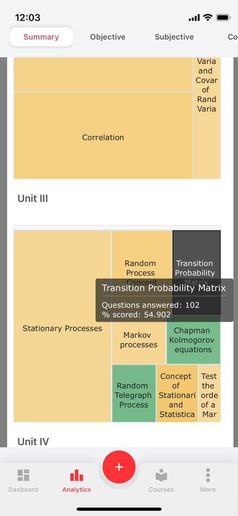
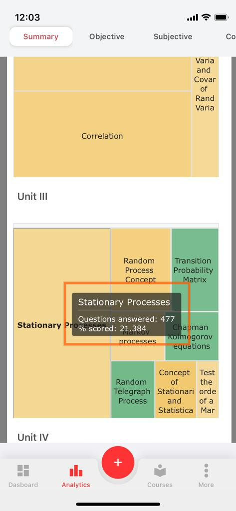
18. Topic Analysis map is a heat map i.e. the color of the map changes depending upon the percentage scored and questions attempted for a particular topic.
d. Overall Metrics:-
A Radar Plot showing the students participating in the assessments (Objective, Subjective, Coding).
19. The edges or vertices of the Radar Plot show you the Number of Assessments attempted falling under the Excellent, Below Average, Good, Average, and Poor Performance categories.
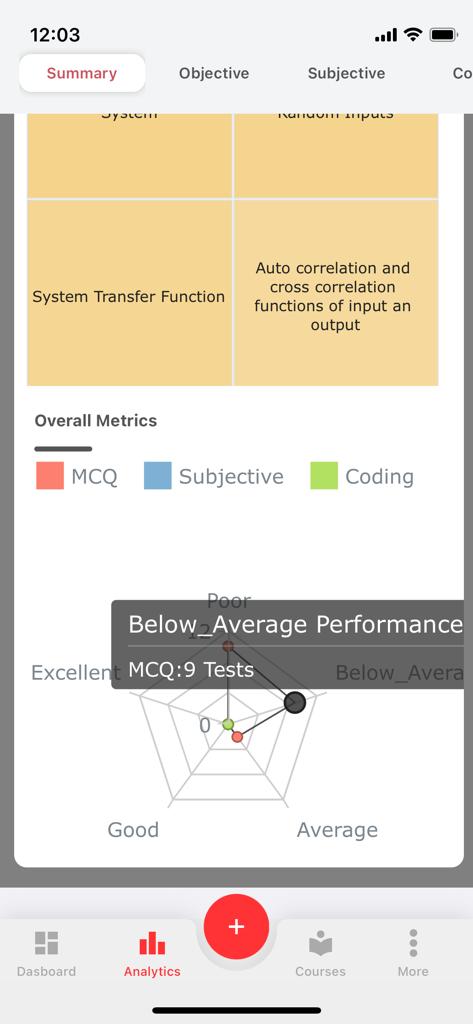
20. Objective, Subjective, and Coding Assessment’s Overall Metrics are given in represented using different colors.
21. On tapping one of the edges of the plot, it shows the number of tests falling under that performance status (good, below average, average, excellent, poor).
e. Aptitude:-
Know the analytical strengths with a detailed category-wise performance report.
22. The summary tab shows the number of questions, attempted questions, correct questions, and average performance.
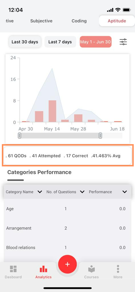
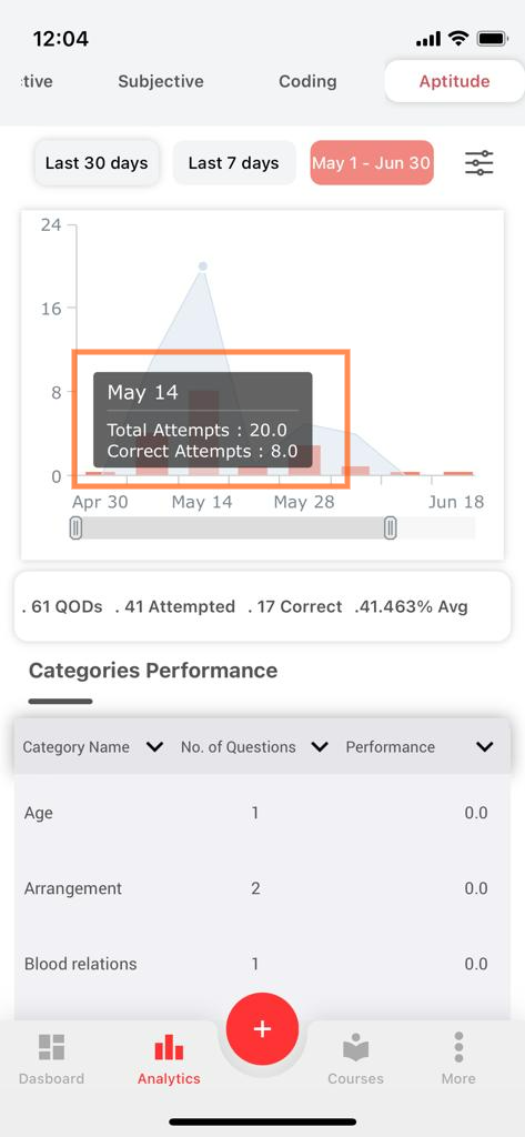
23. The x-axis on the graph depicts the date and the y-axis on the graph depicts the total attempts and correct answers (red bar) as per the filter applied (last 30 days, last 7 days, today, the default filter is the last 30 days).
24. You can get the total attempts and correct attempts data for a particular test by tapping on the graph.
25. In order to view the graph closely, you can pinch-zoom the graph or compress and expand using the scale given below the graph.
f. Categories Performance:-
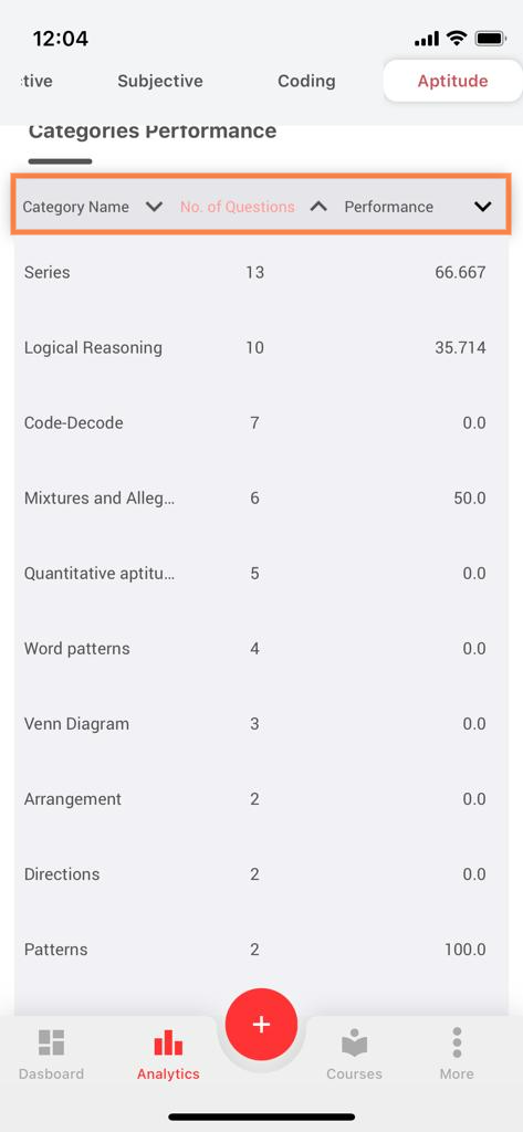
For all the Topics or Categories in Aptitude, you will be presented with information about, the category name, the total no. of questions sent, and the performance.
- You can sort by Category Name, No. of Questions, or Category wise Performance.
HOW TO APPLY THE CUSTOM FILTERS:
For Faculty:
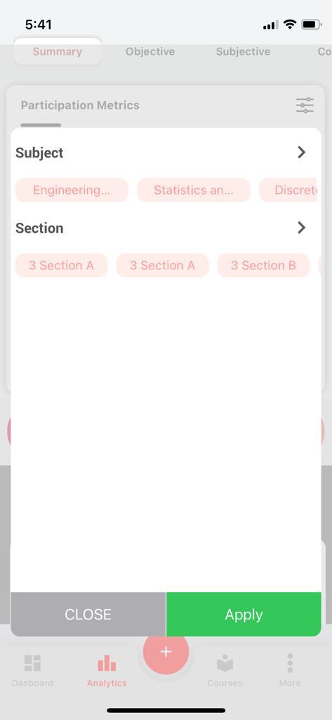
26. For the faculty to use the custom filter, select the custom filter option, where a pop-up page appears with the subject and sections. Select the required filters and click Apply.
For the Management:
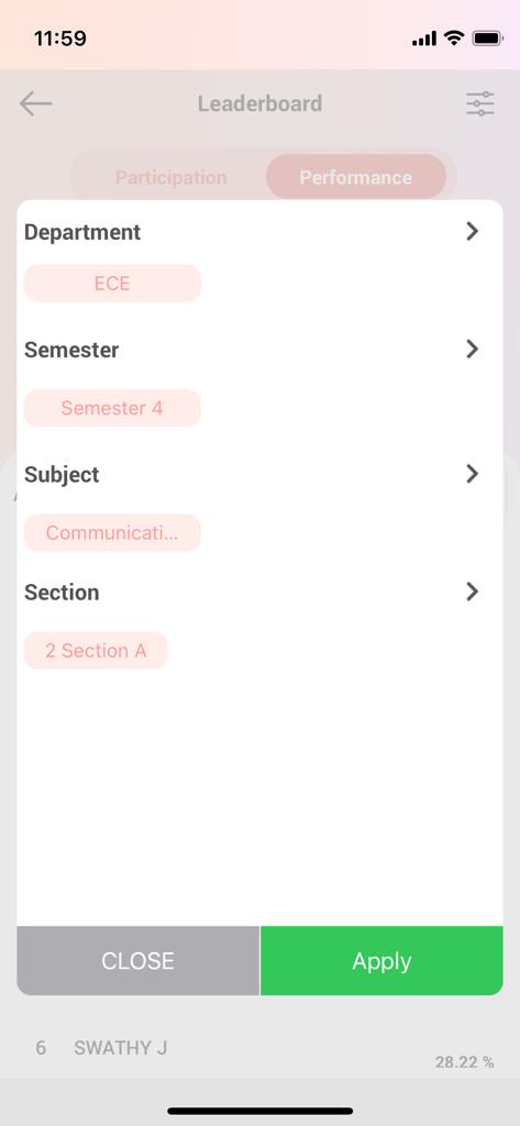
27. For the higher management to use the custom filter, select the custom filter option, where a pop-up page appears with the department, semester subject, and sections. Select the required filters and click Apply.
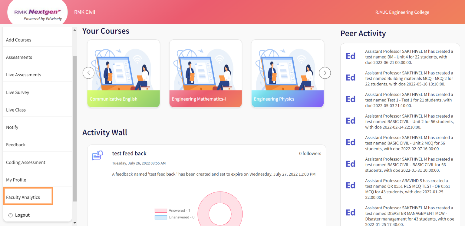
- You can access the “The Analytics” module from the navigation pane on the left. This will display your detailed analytics.
Summary:
A dashboard of yours, viewing participation metrics, leaderboard, detailed subject analysis which includes unit level analysis, topic analysis, overall performance statistics, and subject performances.
a. Subject Performances :
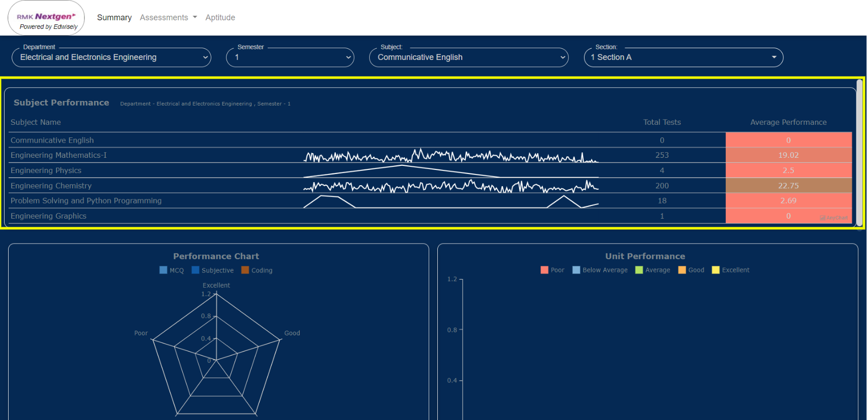
This gives you an overview of the total number of assessments created in each subject and the average performance of it.
2. On hovering over the graph you will be able to see the test name, test performance, total tests, and overall average performance for each subject.
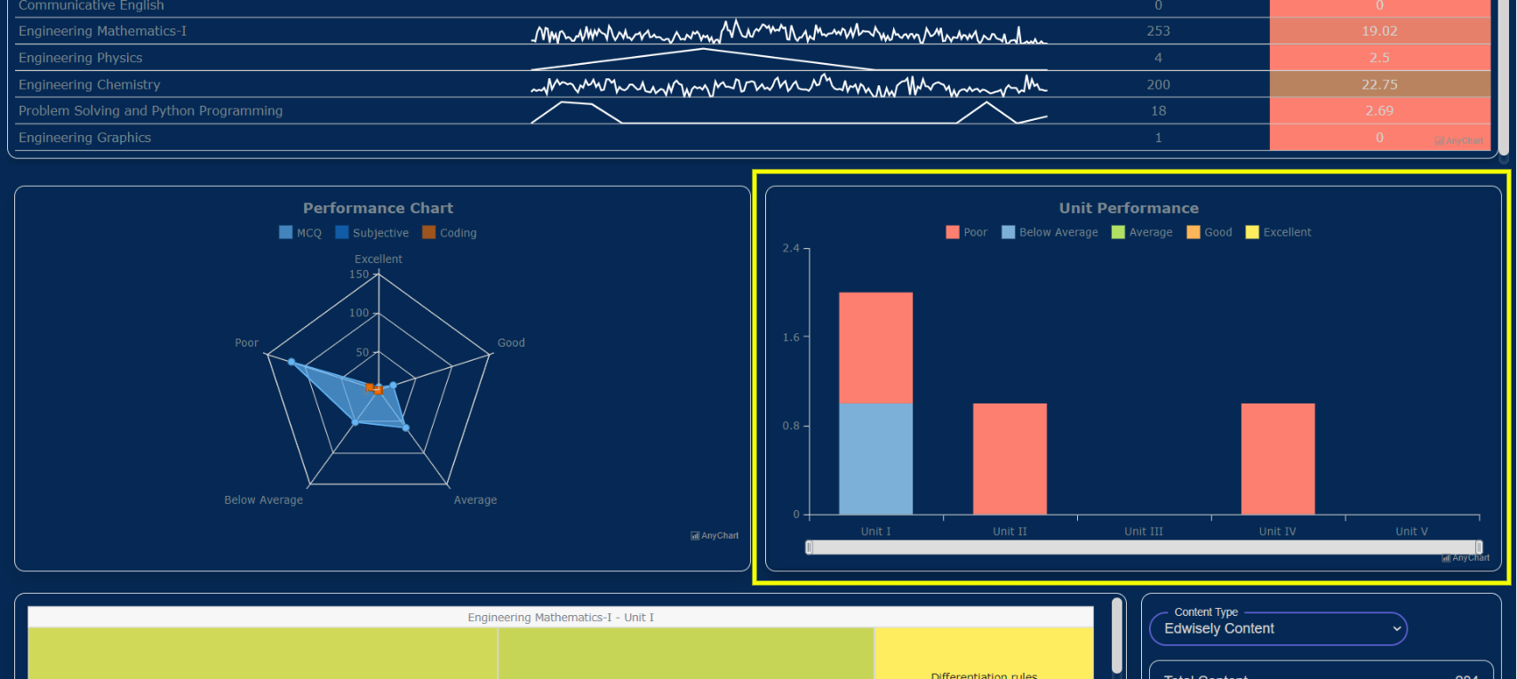
b. Unit Performances:
- A bar chart that gives you a detailed analysis of the Unit level performances of the section(s) for each selected subject.
3. You can get the performance status of the students (excellent, good, average, below average, poor) for each subject by hovering on the individual bar based on the applied filters.
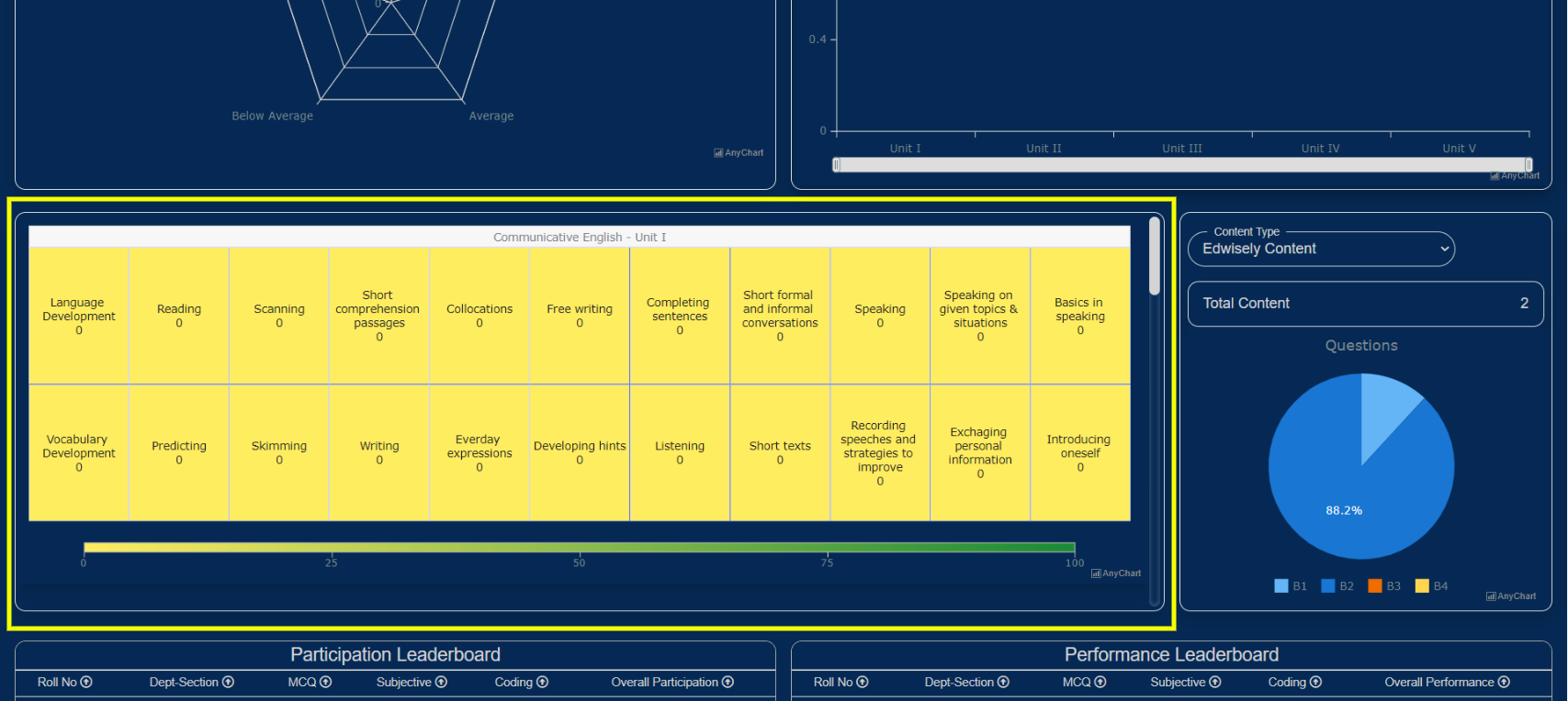
4. The color of the map changes depending upon the percentage scored and questions attempted for a particular topic.
 c. Performance Chart:
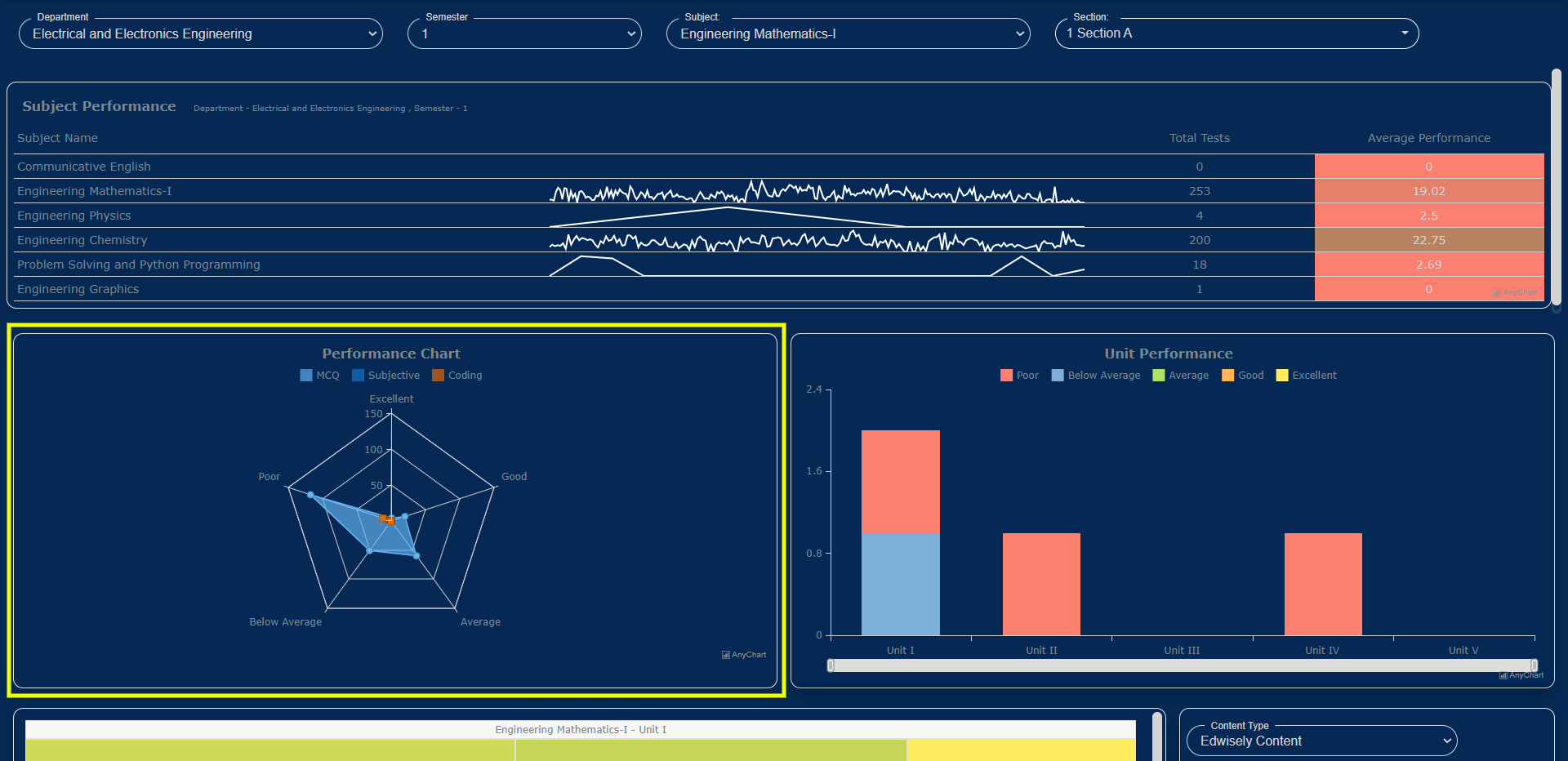
5. A Radar Plot showing the students participating in the assessments (Objective, Subjective, Coding).
6. The edges or vertices of the Radar Plot show you the Number of Assessments attempted falling under the Excellent, Below Average, Good, Average, and Poor Performance categories.
7. Objective, Subjective, and Coding Assessment’s Overall Metrics are given in represented using different colors.
- On moving over one of the edges of the plot, it shows the number of tests falling under that performance status (good, below average, average, excellent, poor).
d. Leaderboards:
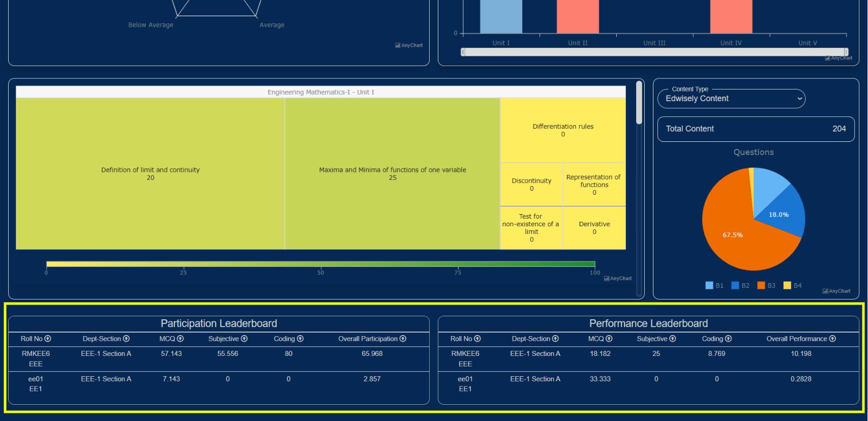
Each student’s performance and participation can be viewed on the leaderboard in a detailed way for all the assessments assigned by you across all the semesters and sections.
8. List of students present in that particular section: The list can be sorted using the filters present (Participation, performance, Name, Roll No.) in ascending or descending order as per your preference.
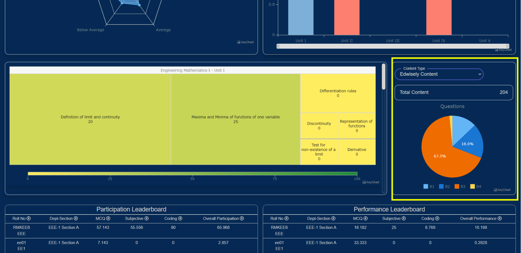
 e. Content type:
This gives you insights into your content as well as edwisely’s content present in the curriculum and the blooms level for the questions.
9. The learning content shows the content uploaded by you(public and private) and edwisely on tapping the type of content filter.
10. The blooms table depicts the blooms level of the questions present in the content.
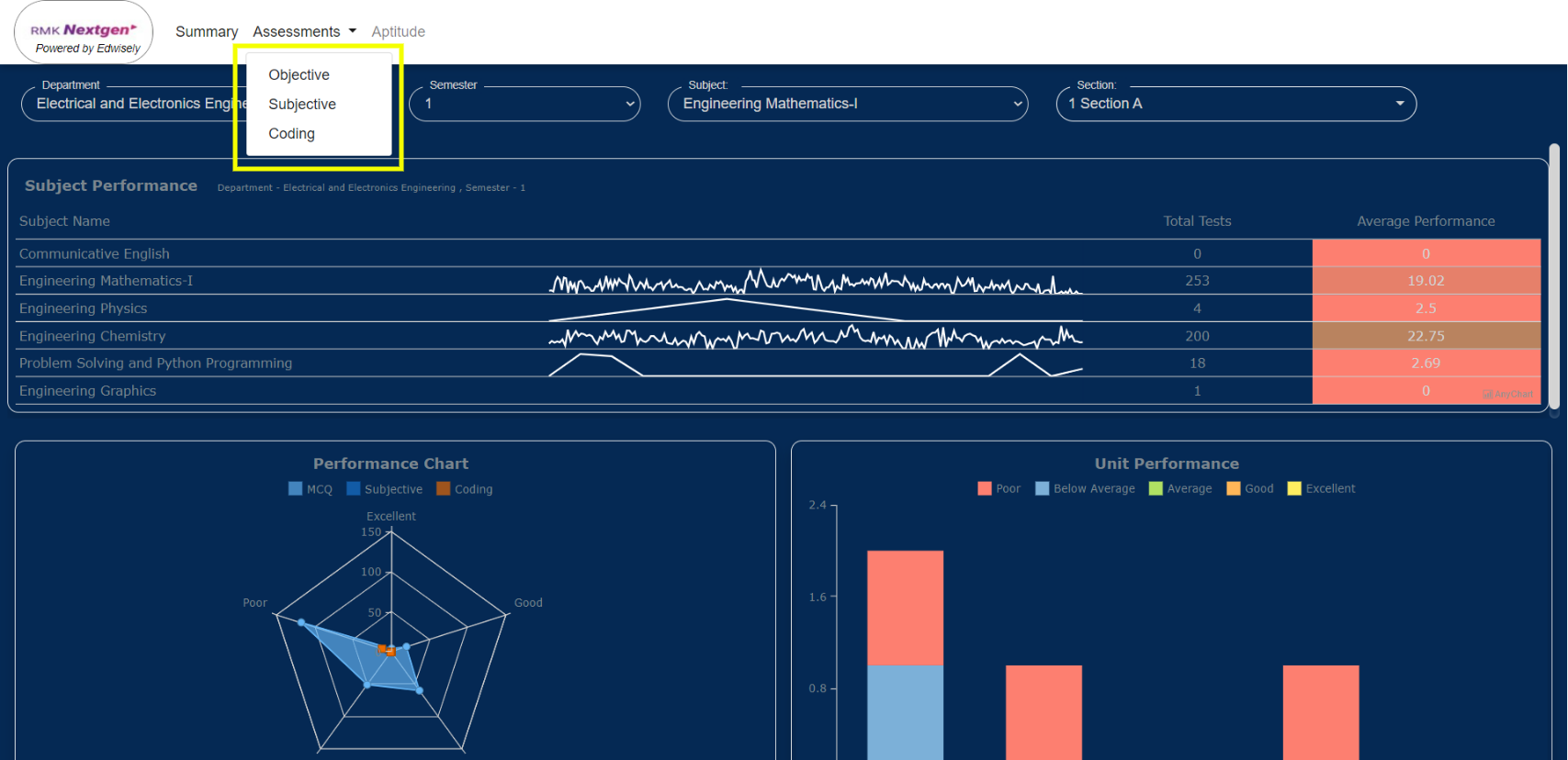
Assessments: (objective, Subjective, and Coding)
11. On selecting the assessments a drop-down appears with the list of options(objective, subjective and coding). Select the required assessment to get its detailed analysis.
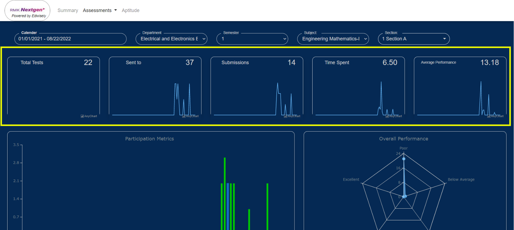
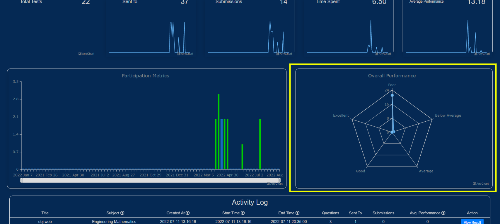
12. The snippet graphs display the total number of assessments conducted and sent by you, the number of submissions taken place, time spent on each test, and the average performance for it.
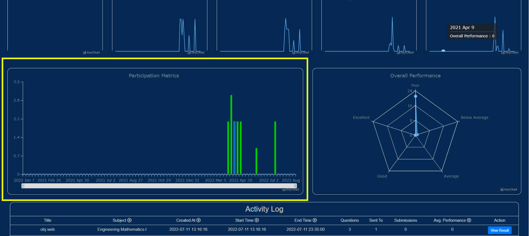
e. Participation metrics:
It gives an overview of the selected assessment performances i.e either(Objective, Subjective, Coding) attempted by the students.
13. Select either Objective or Subjective or Coding where participation metrics are shown for all the subjects in the current Academic semester.
14. The bar in the graph depicts the total number of tests assigned by you, and the total number of submissions that took place on that particular week.
f. Overall performance:
A Radar Plot showing the students participating in the selected assessment (Objective, Subjective, Coding).
15. The edges or vertices of the Radar Plot shows you the Number of Assessments attempted falling under the Excellent, Below Average, Good, Average, and Poor Performance categories.
16. Objective, Subjective, and Coding Assessment’s Overall Metrics are given in represented using different colors.
- On hovering over one of the edges of the plot, it shows the number of tests falling under that performance status (good, below average, average, excellent, poor).
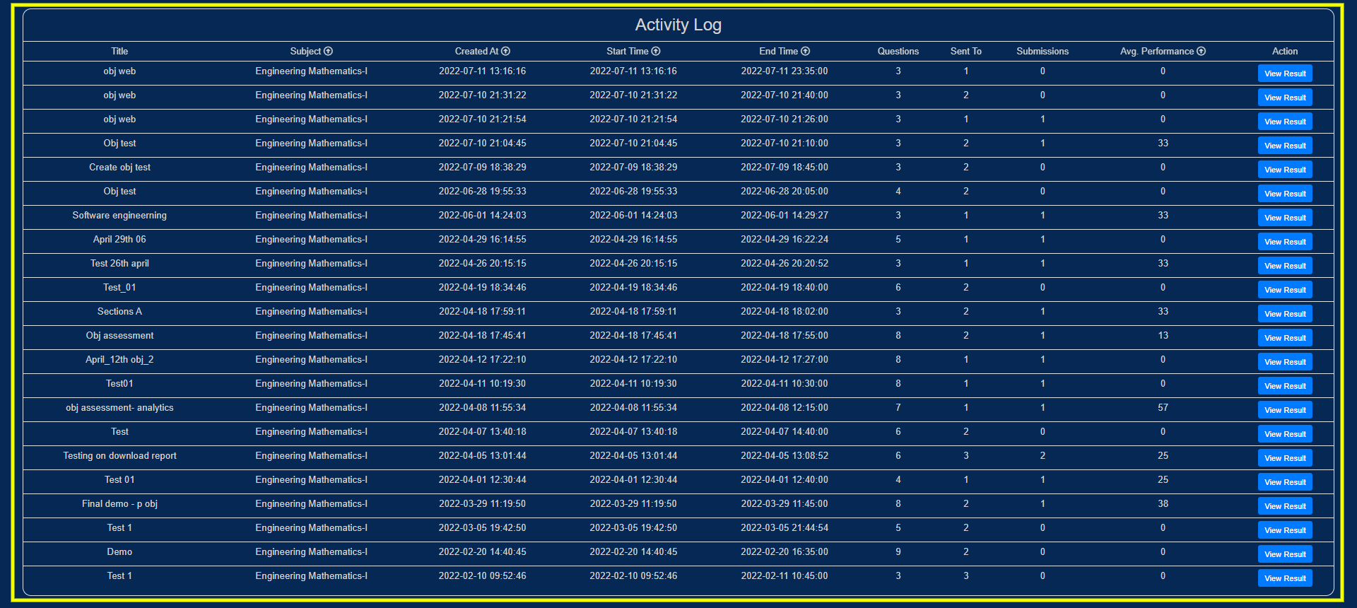
17. The activity log displays the assessment cards which show:
- The assessment name, subject, created time, start time and end time.
- No. of questions present in that assessment.
- No. of submissions done for that assessment.
- The average performance of students for that assessment.
18. On selecting the view results button you will be navigated to the results page of the assessment.
Aptitude:
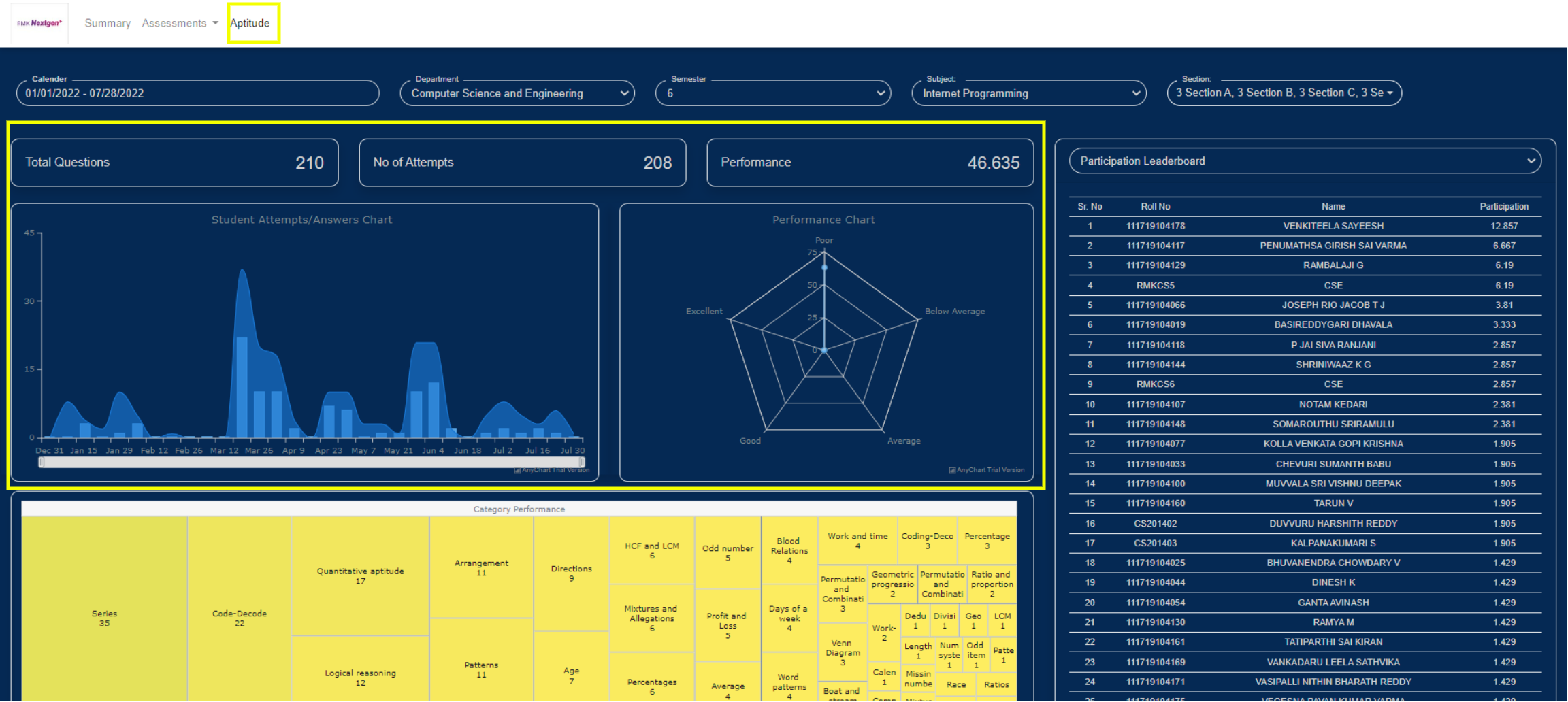
Know the analytical strengths with a detailed category-wise performance report.
a. Student attempts/Answers chart: This displays the total number of attempts and the total correct answers given.
b. Performance chart: The edges or vertices of the Radar Plot show you the aptitude score falling under the Excellent, Below Average, Good, Average, and Poor Performance categories.
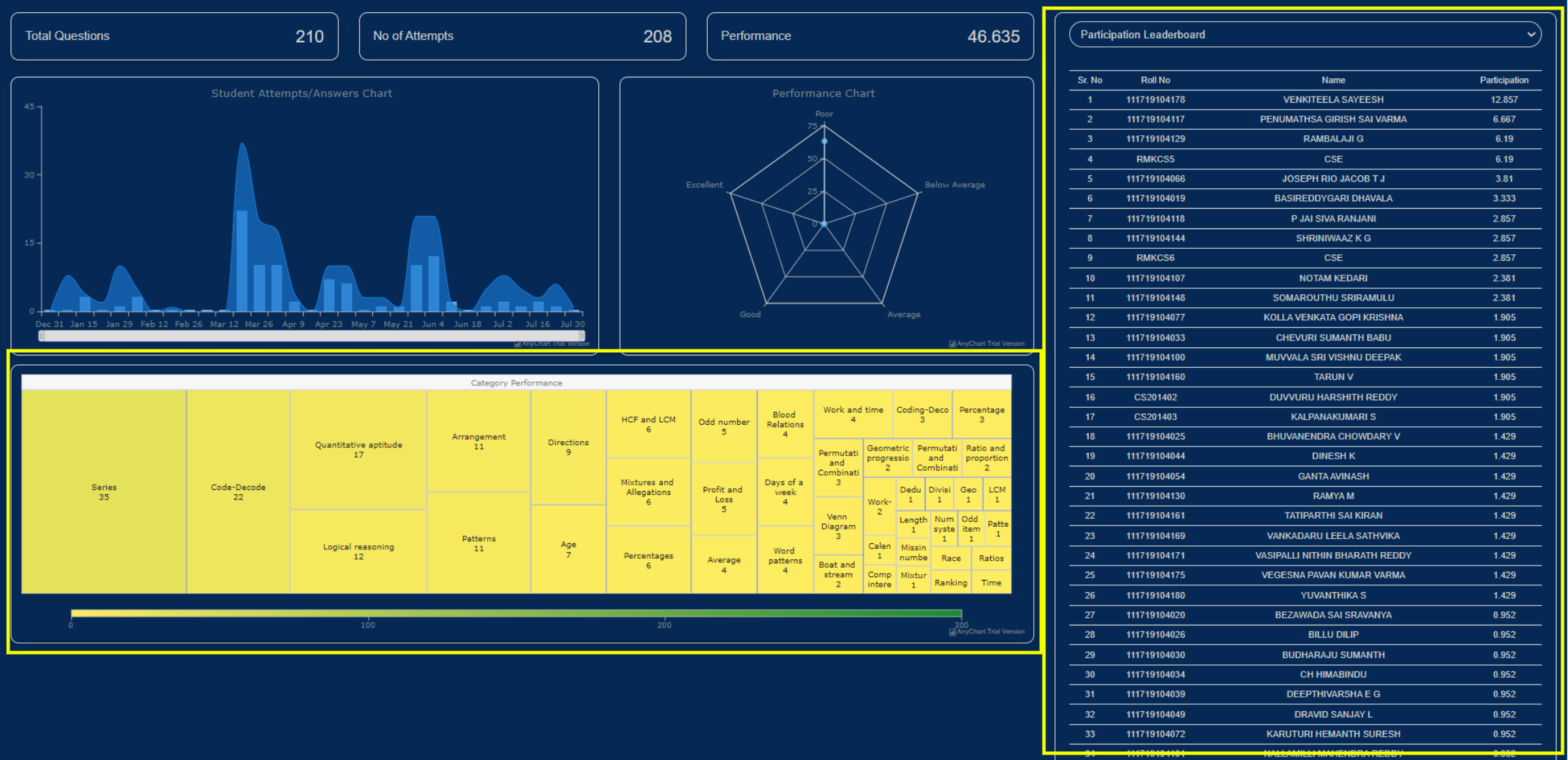
c. Category performance: The heat map shows the different categories of questions. You will be able to get the number of questions present in each category and the average performance of the students in that specific category by hovering over it.
d. Leaderboard: Each student’s participation and performance can be viewed on the leaderboard in a detailed way for all the aptitude tests assigned by you across all the semesters and sections.
- List of students present in that particular section: The list can be sorted using the filters present (Participation, performance, Name, Roll No.) in ascending or descending order as per your preference.
Applying Filters:
19. Faculty has a custom filter feature which can be accessed by selecting the filter dropdowns on the top.
20. With this feature, faculty can filter the analytics by
- Custom dates
- Department(s)
- Subject(s)
- Class/Section(s)
Note: This custom filter will filter both the assessment cards being shown and the graph data.


